NHCS — Mobile UX Assessment
June 5, 2026 | Rails 8 + Hotwire + Optics design system
Executive Summary
components/form.scss. It restacks every multi-column form into a single column,
bumps inputs to a thumb-friendly 44 px, and stops iOS from auto-zooming on focus.
It is the smallest change in the audit and the one your HCPs will feel the most.
Then
- Design tokens are already disciplined. The codebase contains zero hardcoded hex colors and only a single literal HSL value across 23 stylesheet files. Most products this age have hundreds of magic values. NHCS does not.
- Phone numbers are tappable. The shared
format_phonehelper wraps every number in atel:link, so HCPs and admins on phones can dial a facility, an HCP, or the office with one tap. Small detail, big quality-of-life. - The HCP calendar adapts cleanly to mobile. The 7-column month grid
collapses to a stacked daily list with day-of-week labels under
$breakpoint-small. That collapse is a good mobile pattern and shows the team knows how to do this when they choose to. - Native iOS & Android select pickers are preserved. The month and
year pickers on the calendar use raw
<select>elements, so mobile users get the platform scroll wheel rather than a clunky web replacement. - Visual consistency across the app. Buttons, headings, badges, alerts — one design language used everywhere. There is no accumulated “drift” of one-off components, which is the usual symptom of a years-old codebase.
- Stable, well-known tech stack. Rails 8, Hotwire, and a focused component library mean any of these improvements can land safely and incrementally — no rewrite, no framework migration.
Now
Expectations on mobile have moved. Here is what we observed on a 375 px phone, by theme.
Moments where the product asks the user to work harder than they should on a phone. These are not bugs in the desktop view — they are visible only on mobile, which is exactly why they have stayed hidden.
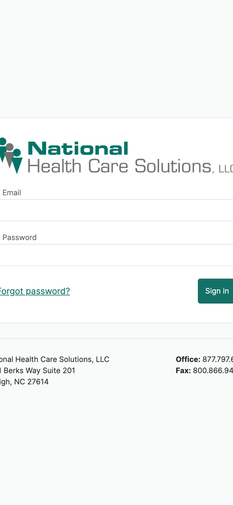
The sign-in card clips off the right edge of the phone. The card has a fixed 450 px width and the phone is 375 px wide, so the "Sign in" button is partially sliced and the logo and footer overflow horizontally. This is the very first thing an HCP sees on their phone — a broken card before they can even authenticate.
The error alert sits floating top-center, far from the inputs and the keyboard, so users do not see it without scrolling up after submitting.
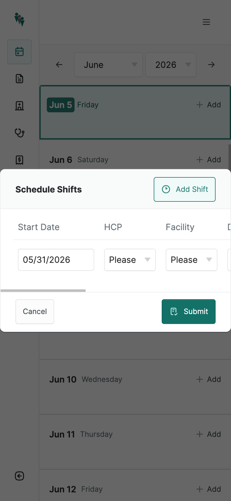
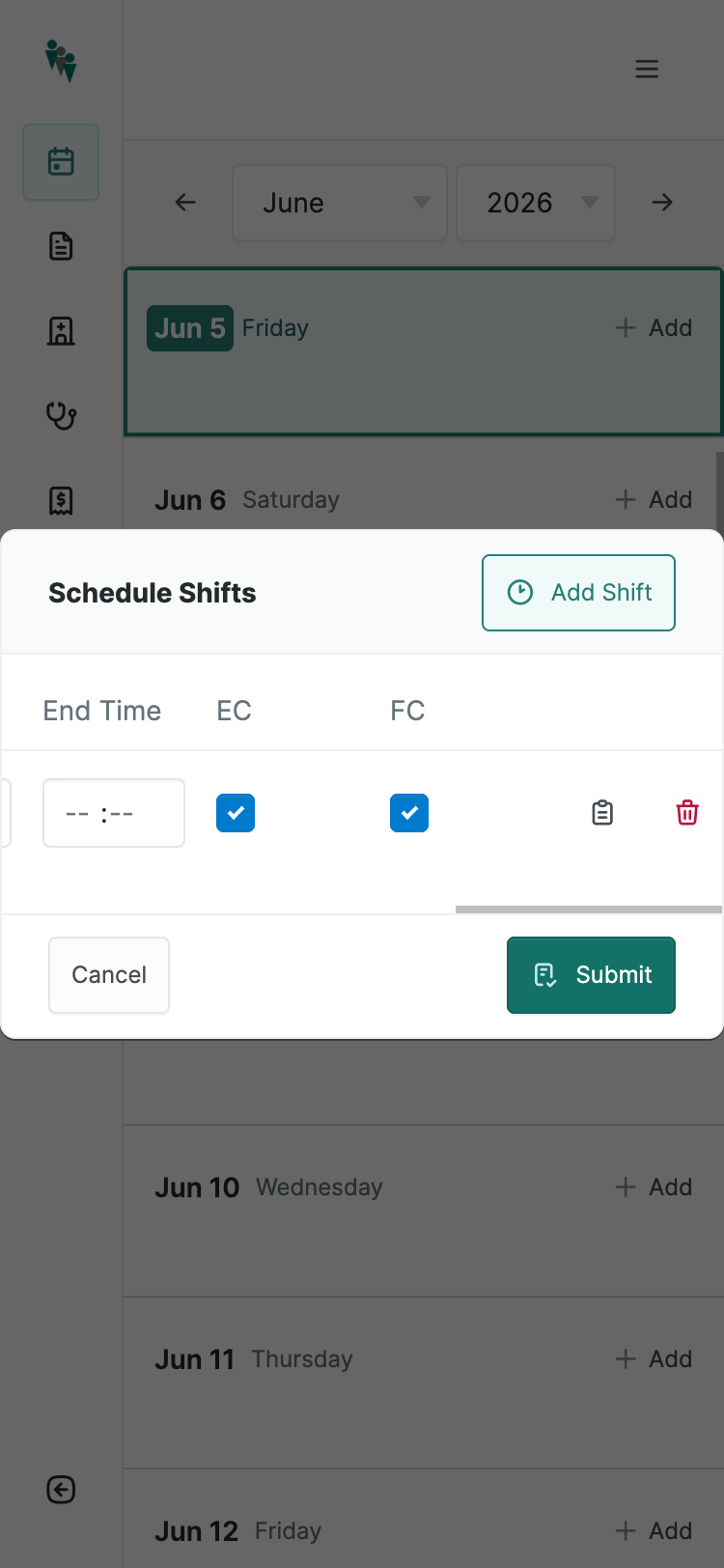
The Add-Shift modal contains a 990 px-wide table inside a 375 px viewport. The form has 10 columns — Start Date, HCP, Facility, Department, Shift, Start Time, End Time, EC, FC, Delete — and renders as a horizontally-scrolling table even on mobile.
To enter one shift, a user has to swipe 637 px sideways inside the modal.
The "Please select…" labels are truncated to "Please" because the column is too
narrow. "HCP Confirmed" and "Facility Confirmed" abbreviate to "EC" and "FC"
because there is no horizontal room. This is the single highest-leverage mobile
fix in the audit — collapsing the row to a stacked card under
$breakpoint-small.
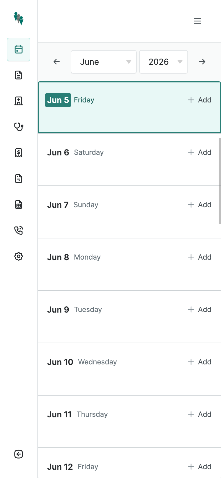
The sidebar rail never collapses for admin users on mobile. About 80 px (21% of horizontal viewport) is permanently lost to a navigation rail that ought to be hidden behind a drawer toggle. HCPs get a proper drawer pattern — admins do not, even though admins also use the platform on phones.
The hamburger toggle is in the top-right corner, opposite the standard iOS/Android convention. Users will reach for the top-left out of habit.
:hover tooltips for their meaning. On a
phone there is no hover state, so the colors are unexplained. This also fails WCAG
1.4.1 (color-only status), regardless of device.The application’s form system uses horizontal grids that look balanced on a 1200 px screen but proportionally shrink on a phone — instead of restacking. Every form in the app inherits this. This single architectural choice is the source of most of the form pain.
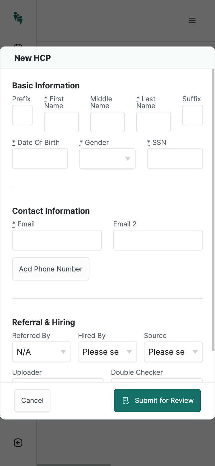
The New HCP form puts five name fields in a single horizontal row on a 375 px phone. Measured live:
- Prefix — 36 × 36 px (below the 44×44 floor)
- * First Name — 60 × 36 px
- Middle Name — 60 × 36 px
- * Last Name — 60 × 36 px
- Suffix — 36 × 36 px
For comparison, an iOS keyboard key is roughly 32×42 px. The required "First Name" input is narrower than the spacebar typing into it.
The next row crams Date of Birth, Gender, and SSN into three columns at 98 px each. SSN, nine digits, gets the same width as the (already-cramped) middle-name field.
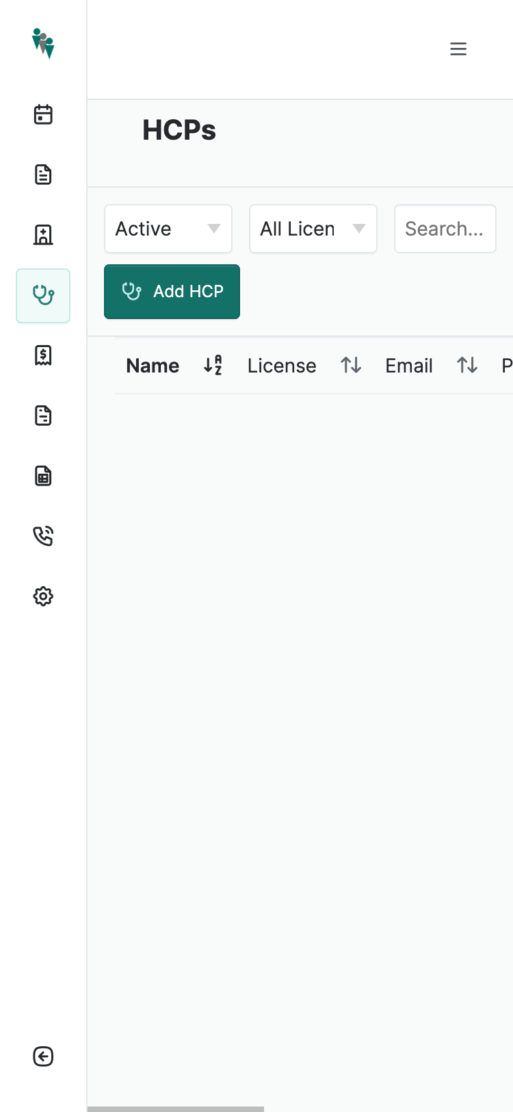
Data tables across the app are horizontally scrollable on mobile. The HCPs index, the timesheets index, the reports — all share the same desktop table layout and require the user to swipe sideways to see Name, License, Email, Phone, and Actions.
The filter chips above ("Active", "All Licen…", "Search…") wrap awkwardly and
truncate their own labels. A list-of-cards pattern under
$breakpoint-small would let the same data live full-width and
thumb-readable.
* next to required labels uses an
<abbr> with hover-only "required" text. On a phone the asterisk is
visible but its meaning is invisible. A visible "(required)" label or a clear visual
treatment lands the same information without the tooltip dependency.Table-stakes mobile platform features that exist on every comparable healthcare staffing app (Clipboard Health, ShiftKey, ShiftMed) and on every consumer app the HCPs already use (Uber, DoorDash). These are not stretch goals — they are the conventions of 2026.
date_input_controller overlays the
flatpickr library on top of the Rails type="date" field. On desktop this
adds a nice calendar grid; on mobile it replaces the native scroll-wheel date
picker — which is the picker iOS users prefer. The fix is one media query:
skip the controller on (pointer: coarse) devices.type="time" gives them the native picker on mobile,
with AM/PM and scroll affordances. The custom widget is great on desktop where users
type fast; on mobile it is slower and more error-prone than the platform native.apple-touch-icon.png in
/public but no manifest.webmanifest and no service worker.
Add to Home Screen produces a chrome-less web page with no app feel. Adding a manifest
is one file, ~50 lines, and immediately gives HCPs a real-looking app icon plus a
splash screen plus standalone mode.A glimpse of what this product could do that it does not today. These ideas come from the actual workflow — HCPs in the field, picking up shifts between drives, calling facilities, navigating to addresses.
maps:// on iOS or a generic geo: URL means one tap opens
turn-by-turn directions to the facility. For a workforce that drives between shifts,
this is the most-requested integration in every adjacent app.