What the platform can do, and what C12 should do with it
Six iOS capabilities neither shipping C12 app references anywhere in its source. For each one: real apps that already ship it, the design mechanic that makes it work, and a concrete C12 translation — drawn with C12 content, not lorem ipsum.
Meeting Day, live on the Lock Screen
Forum day is a scheduled, multi-hour event. That is exactly the shape ActivityKit was designed for, and no other C12 surface competes for attention while it runs. The card below shows only what C12 already stores — the meeting date, who is attending, and the member’s own todos.
Why the references work
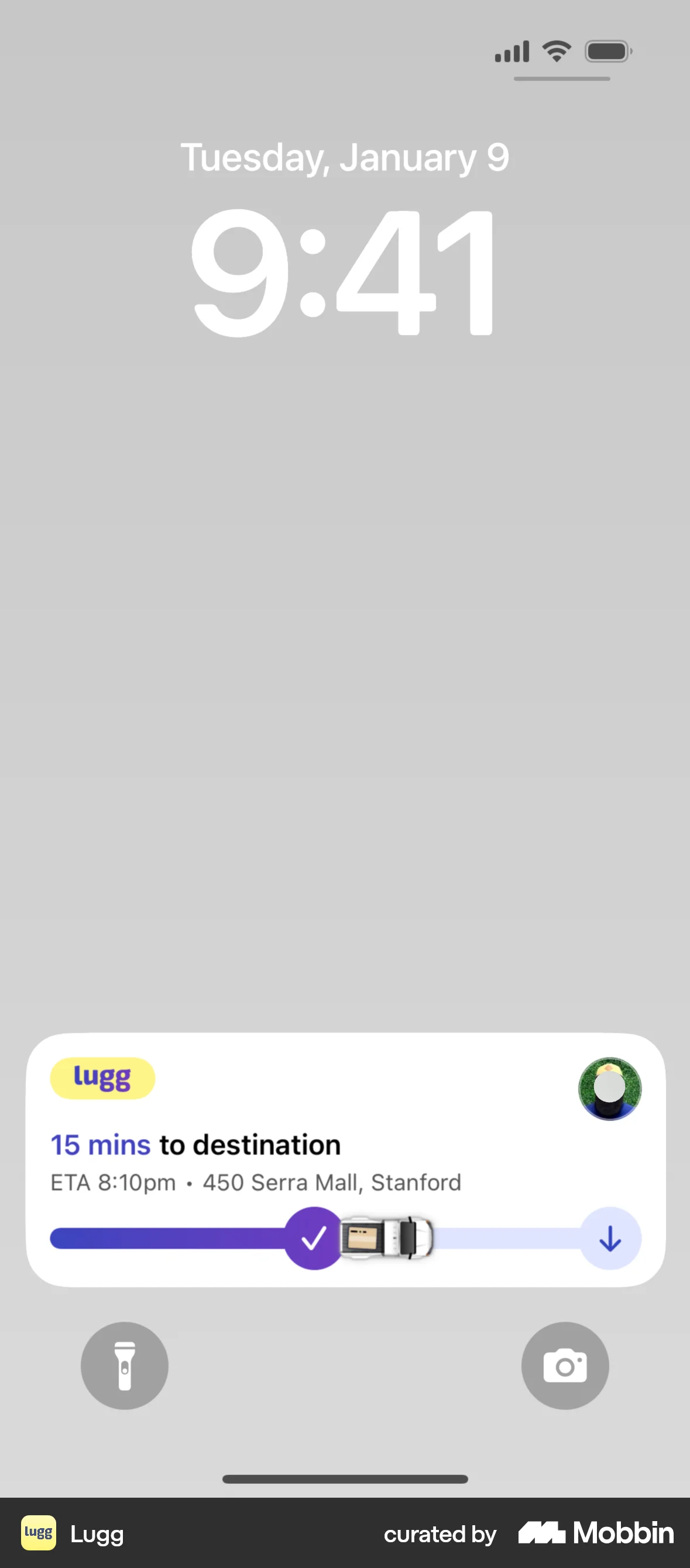
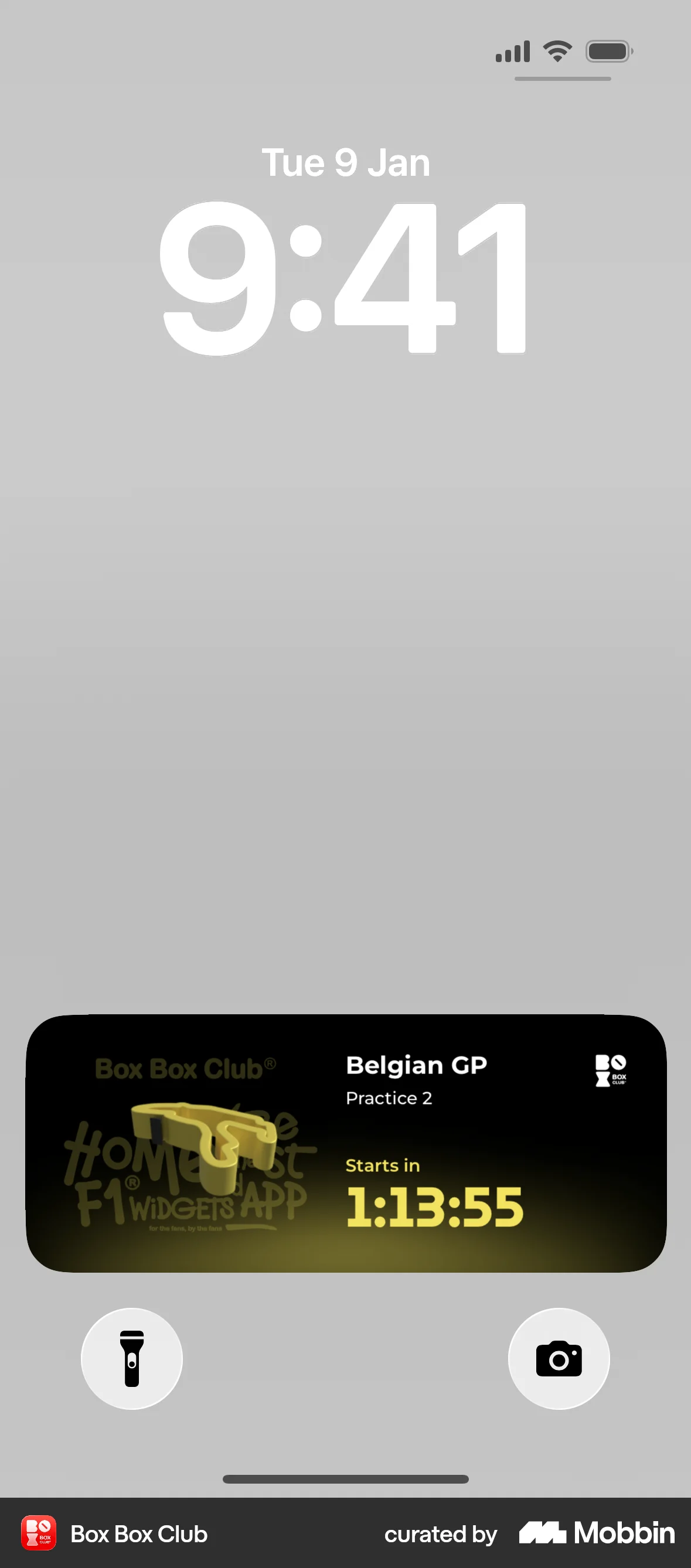
- One number owns the card. Lugg says
15 mins; Box Box says1:13:55. Everything else is supporting text, set two sizes down. - A named human, not a status code. Lugg shows the driver's face. Trust comes from the person, not the progress bar.
- The bar is the glance. You read progress before you read a single word.
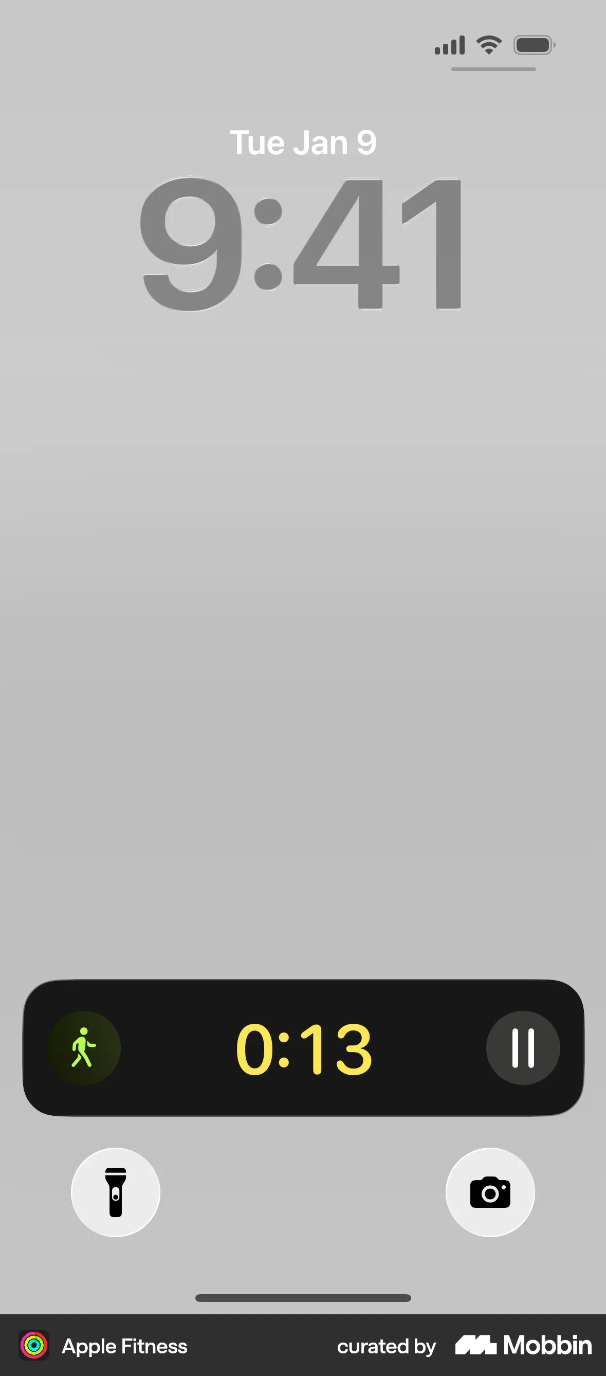
- It survives being tiny. Apple Fitness collapses to an icon and a timer and still reads.
The C12 translation
- The number is time left in the day.
Meetingholds the date; attendance comes frommeeting_members. Both already exist. - Attendance is the second line. “11 of 12 here” is the thing a Chair checks first, and C12 already records it.
- The member’s own todos close the card. Due today, still open — the one thing forum day is for.
- Four states across the day:
Starts in 1:12→4:18 remaining→Break→Meeting complete · 4 commitments captured. - A session-by-session running order needs Rails first.
Meetingcurrently holdsmonth,date,forumand attendees — there is no agenda, no sessions and no presenter. Showing “CORE Presentation, Dave Whitfield, up next Ed Gaines” would mean inventing an agenda model. Worth building, and named as a prerequisite in the roadmap.
The 30-second glance, without opening the app
Eleven months of the year a C12 member does not need a screen — they need two facts: when is the next forum, and what do I owe someone. Widgets answer both without a launch, a login, or a load.
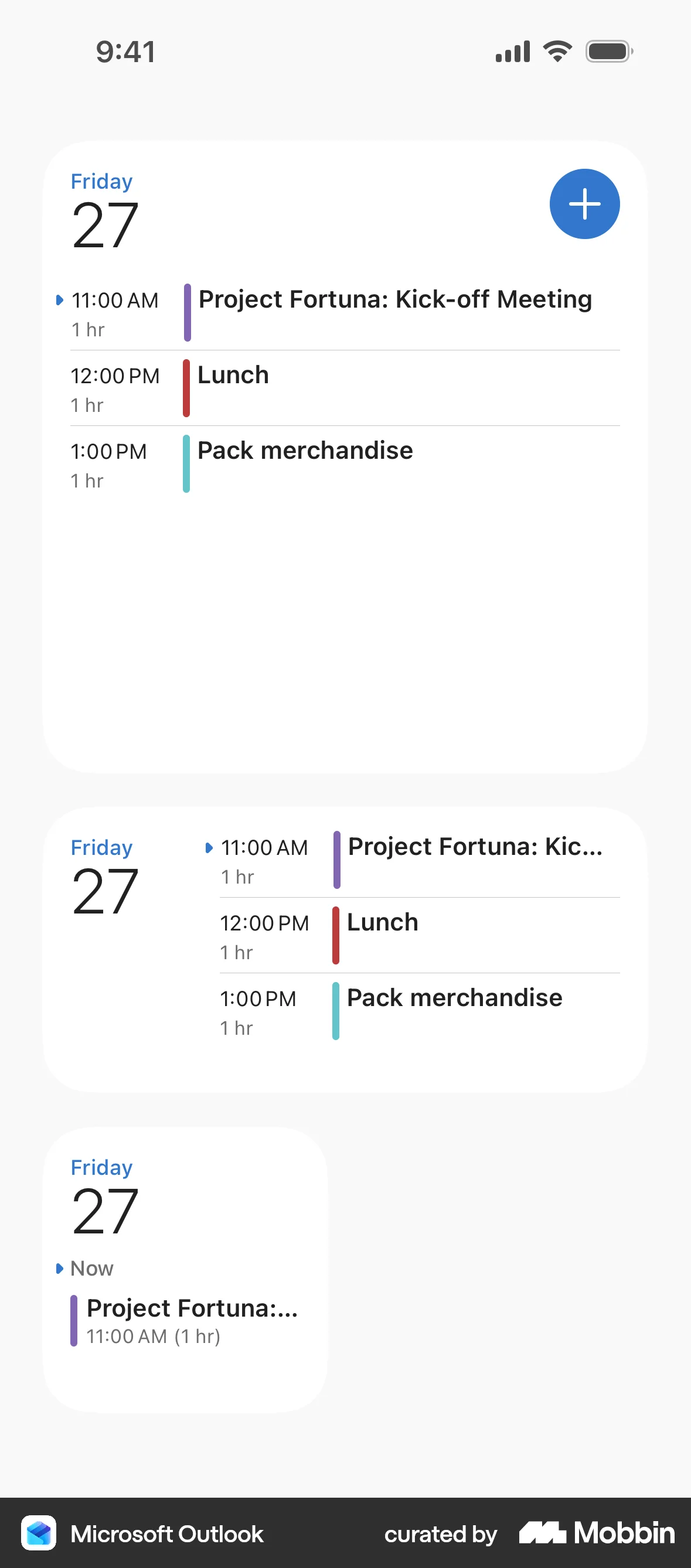
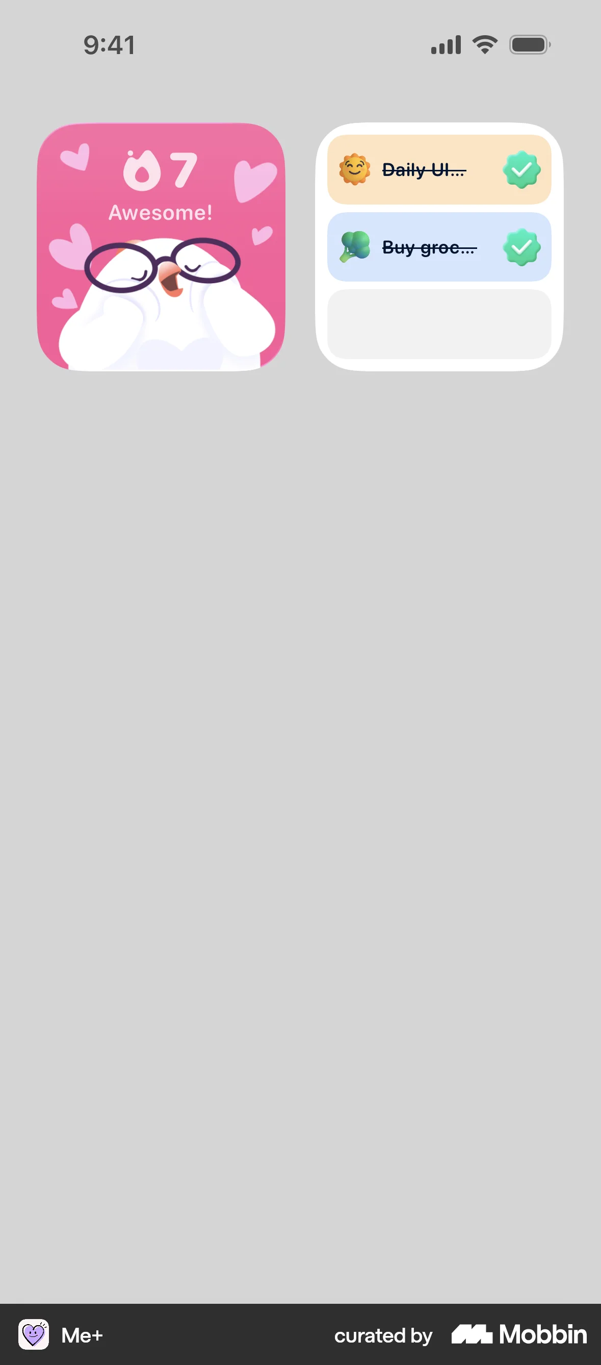
Why the references work
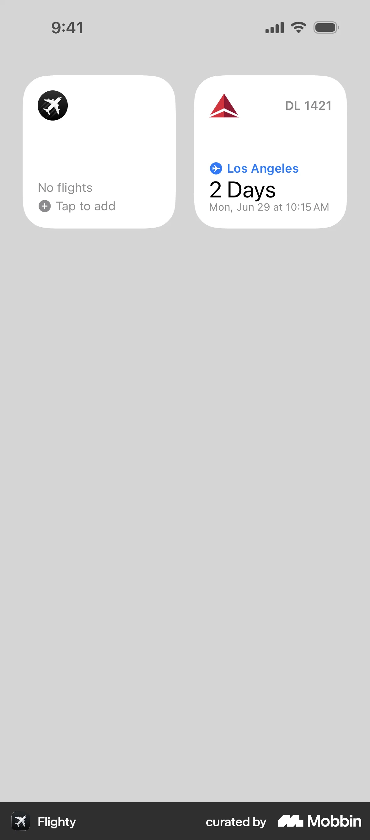
- Flighty commits to one unit.
2 Daysin the largest type the tile allows, then the exact date underneath. No clock, no bar, no icon competing. - Outlook's time rail does the sorting for you. A coloured spine plus left-aligned times means you find “now” without reading.
- Me+ makes the widget a place you act, not a place you look. Tapping the circle completes the task — the app never opens.
The C12 translation
- Small — Next Forum. Days, date, chapter, venue. Deep teal so it reads as C12 on a crowded home screen. The default widget for every member.
- Small — Owed by you. Peer accountability is the product. Interactive check-off means a commitment gets closed in two seconds at a red light.
- Medium — Running order. Appears only on meeting day, mirrors the Live Activity, and gives the room a shared clock.
- One rule across the family: a widget states a fact or offers one action. It never asks the member to interpret a chart.
A tab bar that knows where you are
Today the iOS tab bar tints selected and unselected with the same colour at different opacity, and the two apps disagree on what the second tab even is. The iOS 26 treatment is free, floats correctly, and can finally carry one shared brand.
Dashboard
Why the references work
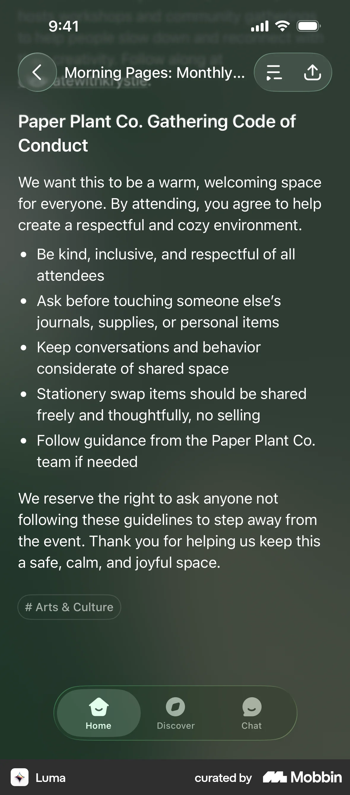
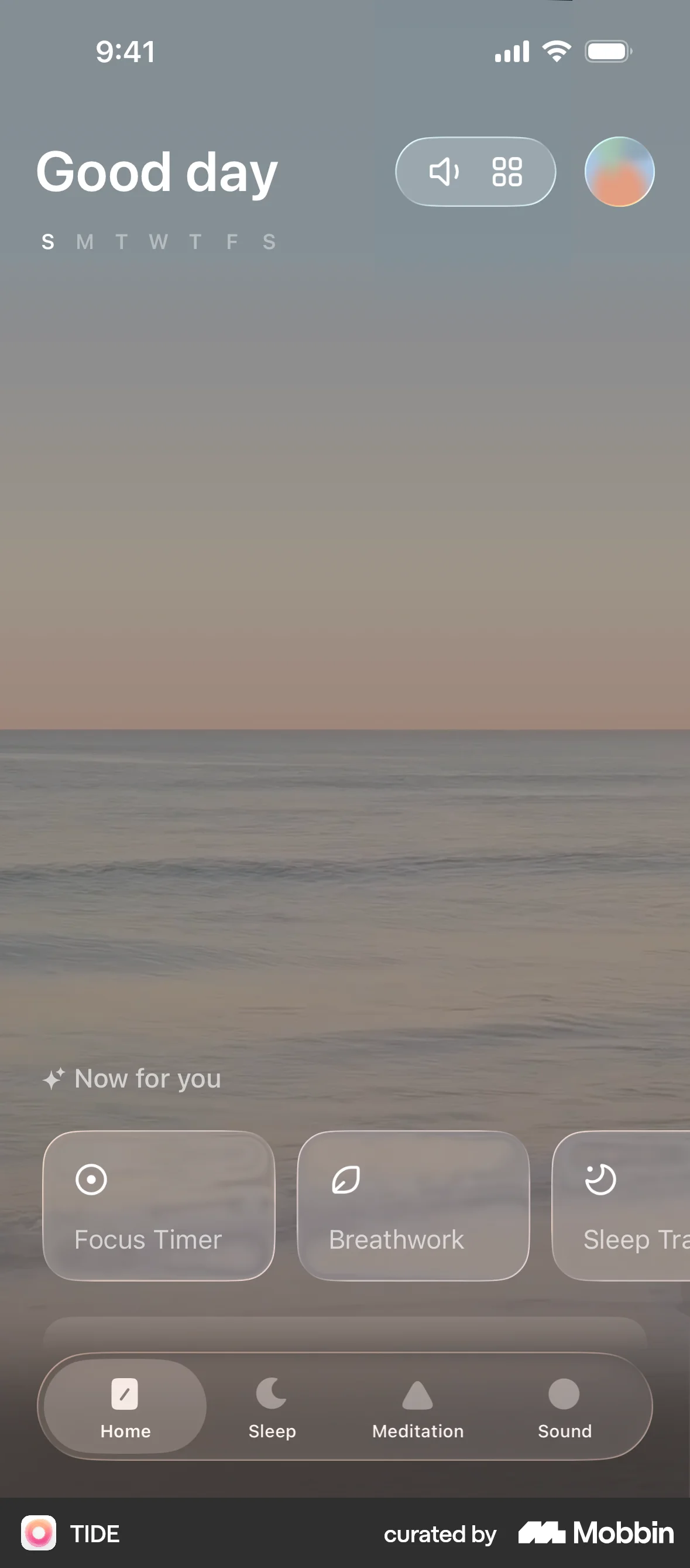
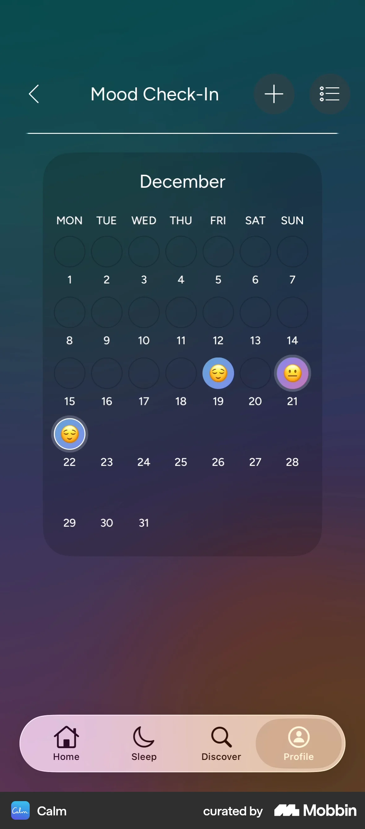
- The bar floats, it does not sit. A capsule inset from the edges tells you content continues underneath — and the system, not your code, keeps it clear of the home indicator.
- The tint is the brand. Luma and TIDE both tint the glass rather than the icons, so the bar belongs to the app without shouting.
- The selected pill is a solid shape. Calm and CLEAR both fill the active tab. Colour alone is not enough — a filled shape survives sunlight, colour blindness, and a glance.
The C12 translation
- Deep teal glass, gold tint on the live tab. No coloured pill — iOS marks selection with the tint colour, and gold on deep teal clears WCAG AA at 7.4:1.
- Keep all five destinations. The shipping app already uses Dashboard, Resources, Curriculum, Notifications and More. The information architecture is fine — this is a finish, not a re-think.
- Each tab keeps its own history. Today every tap reloads the root. Per-tab stacks mean leaving Discussions and coming back returns you to the reply you were writing.
- Badges belong here. Unread discussions and overdue todos get counts, which removes the need to open the app to check.
- Android twin: the same five destinations in a Material 3 Expressive navigation bar, with predictive back and edge-to-edge.
Catch me up — without the content leaving the phone
C12 discussion threads carry confidential revenue numbers, layoffs, marriages and prayer requests. Every mainstream summarise button sends that to someone else’s server. Apple’s on-device model does not — and that distinction is the feature for this audience.
- Ron is 40% off plan and weighing two redundancies before year end.
- Six peers replied. Four urge cutting once and deep; two suggest a 90-day salary freeze first.
- Ed offered his severance script. Marcus asked to pray with Ron this week.
- You were asked directly: Ron wants your take on the freeze, since you did it in 2023.
Why the references work
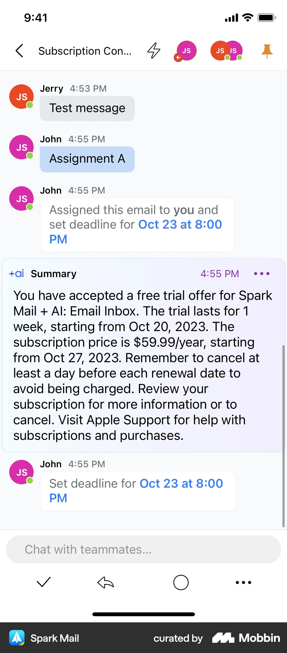
- Placed where the reading stops. Spark puts the block at the unread boundary, so it answers the question you already had.
- Visually marked as not-human. A distinct fill and an explicit label mean nobody mistakes a summary for a peer’s words.
- Bounded, not chatty. Three or four bullets and a way out. It is not a chatbot living in your thread.
The C12 translation
- The privacy line is the hero, not the footnote. “Summarised on this iPhone. Nothing was sent anywhere.” For Christian CEOs sharing confidential detail, that sentence sells the feature.
- The last bullet is always about you. “You were asked directly” converts a summary into accountability — which is what C12 exists to do.
- Draft, never send. The model writes into the composer; the member edits and sends. A machine must not speak into a prayer request.
- Name it in plain words. “Catch me up”, not “AI Summary”. It describes the member’s intent, not the technology.
- Android parity: Gemini Nano through ML Kit GenAI, with the same on-device promise and the same wording.
Notifications you can finish without opening the app
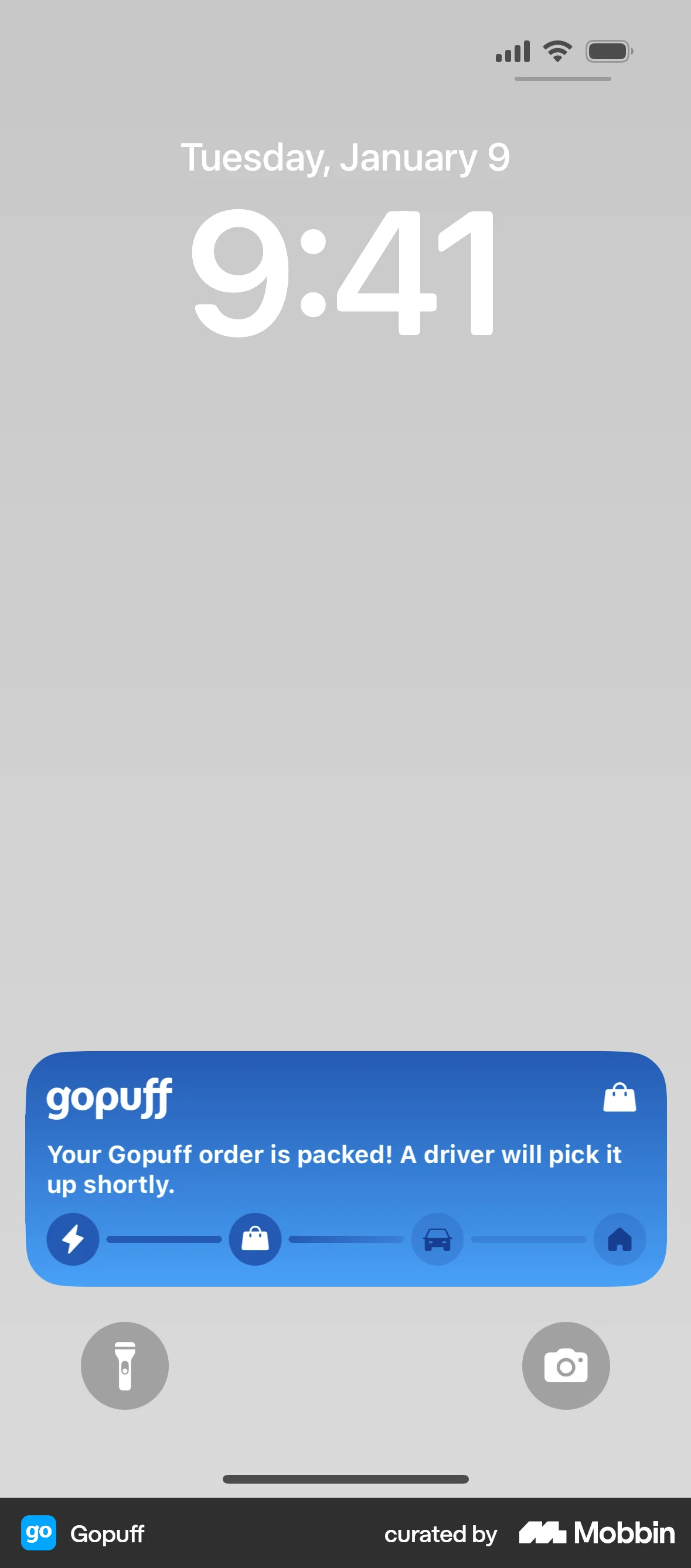
C12 already sends push, and a notification already routes to the exact screen via its urlStack. What it does not do is let a member finish the job from the notification — and because neither app declares applinks, an emailed link still opens a browser and asks a CEO to sign in again.
Why the references work
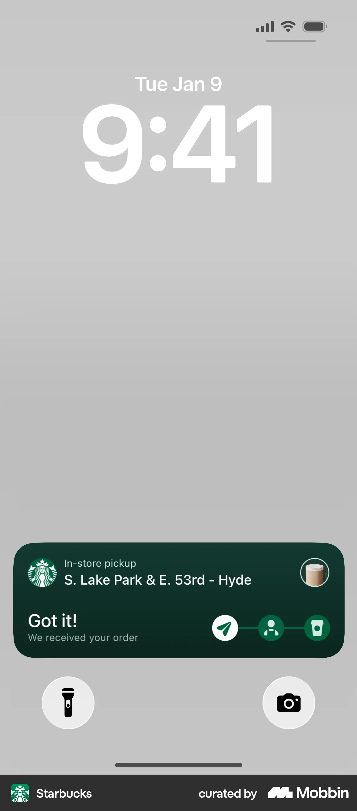
- The actions match the moment. Starbucks offers exactly what you would do next, in the order you would do it.
- One action is clearly primary. A filled button removes the decision.
- Gopuff shows state, not just news. The notification updates in place rather than stacking five of them.
The C12 translation
- Peer replies are communication notifications. Registering them as such gives you the peer’s photo and lets them through Focus as a person, not an app — correct, because they are a person.
- “I’m praying” is a one-tap action. A tiny, C12-specific acknowledgement that costs nothing and means a lot. No other app has this button.
- The meeting reminder carries the two blockers: where to go, and what you still owe. It is the reminder that makes the room better.
- Universal links are the prerequisite. Every tap lands on the exact screen inside the app, already signed in. Without Associated Domains none of this works.
- Android: separate notification channels for reminders, replies and curriculum, so a member can mute chatter and keep the things that matter.
Built for people carrying their own P&L
Two ideas that share one root: C12 holds a member’s real financial position, so getting in should be instant for them and impossible for anyone else — and finding something inside should not require navigating to it.
C12 is locked
Your numbers stay covered when you put the phone down. Look to unlock.
Why the references work
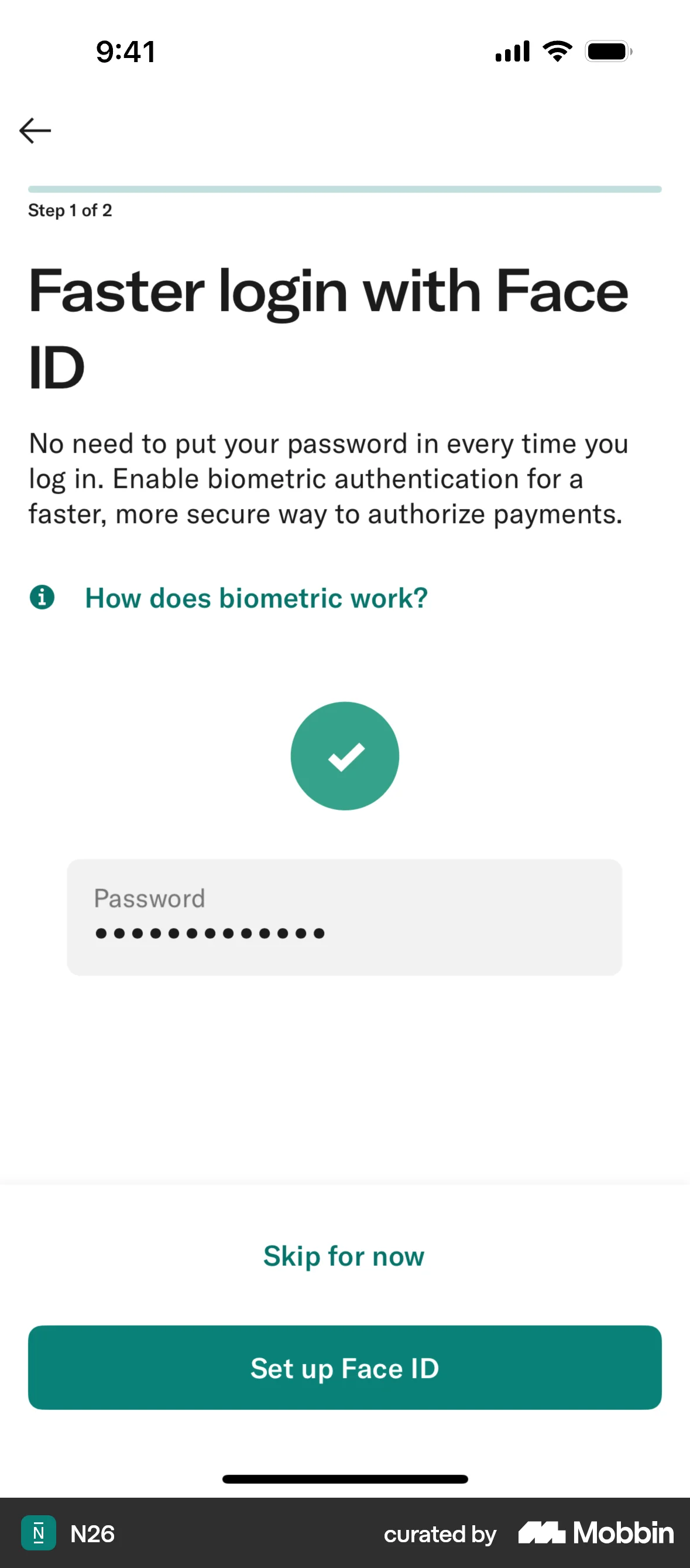
- N26 names the value, not the technology. “Faster login” first; the biometrics are how, not why.
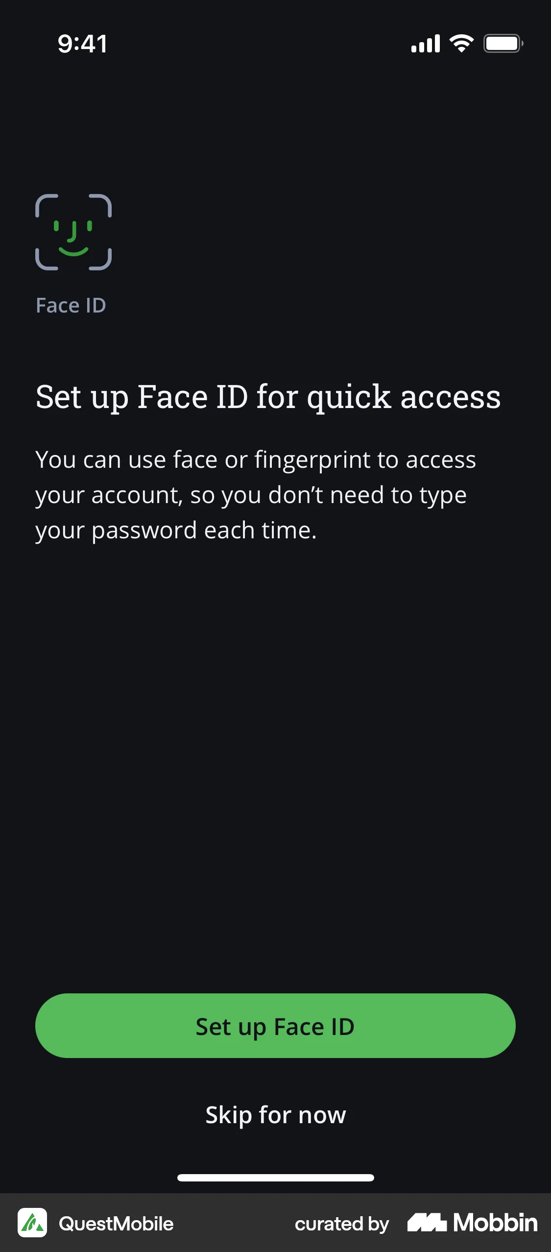
- Both offer a clear way to decline. “Skip for now” sits under the primary button. Security you cannot refuse feels like a trap.
- The blurred-content lock is understood by everyone. Banking apps taught the whole market what it means.
The C12 translation
- Lock the numbers, not the app. Discussions and the meeting schedule stay open; the financial dashboard and monthly report blur after a few idle minutes. Security where it is warranted, friction nowhere else.
- Copy that respects the reader: “Your numbers stay covered when you put the phone down.” Concrete, calm, no fear.
- Passkeys replace the web-view password. Today a CEO types a password into a web view to reach their own P&L. That is the weakest link in the product.
- Spotlight indexes peers, todos and meeting notes. Members think in people’s names. Typing “Ed Gaines” should surface Ed, not require three taps.
- Two Siri phrases, not twenty. “Add a todo to C12” and “When is my next C12 meeting?” Ship the two people will actually say.
Five rules holding these six concepts together
- 1. Design for the glance first. Eleven months of the year the best C12 experience involves no screen time at all. Widgets and notifications are the primary product; the app is where you go when the glance was not enough.
- 2. Native surfaces carry state; the web view carries content. Do not port member screens into Swift. Spend native effort on things a web view physically cannot do.
- 3. Every surface names a person. C12 is a peer network. A presenter, a peer who replied, a Chair — never a bare status string.
- 4. Privacy is a visible design element. If a computation happens on device, say so on the surface where it happens. For this audience that line is a feature, not a legal footnote.
- 5. One fact or one action per surface. No widget, notification or Live Activity asks a member to interpret. It states something true or offers one thing to do.
What to build first
Ordered so the most persuasive thing exists earliest. Concepts 3 and 5 also close “Needs Attention” findings from the UX assessment, so they pay for themselves twice.
| Concept | Phase | Prerequisite | Why now |
|---|---|---|---|
| 3 · Liquid Glass tab bar | Quick Win | Hotwire Native 1.3 | Fixes the “where am I” and lost-scroll findings. Members feel it on day one. |
| 2 · Widgets | Quick Win | App Groups entitlement | Highest engagement per hour of work. Reads meeting and todo data that already exists. |
| 5 · Notification actions | Phase 2 | Associated Domains | Push already ships. Actions and universal links make it finishable. |
| 1 · Live Activity | Phase 2 | Chair-side agenda control | The flagship demo. Needs the Chair’s running order to exist in Rails first. |
| 6 · Passkeys & Spotlight | Phase 2 | Auth change in Rails | Removes the weakest link in a product holding member financials. |
| 4 · On-device summaries | Phase 3 | iOS 26 target, Apple Intelligence device | Strongest story, narrowest device reach. Best once the rest is solid. |
Sources & credits
Reference screens curated by Mobbin and linked individually above — Lugg, Box Box Club, Apple Fitness, Flighty, Microsoft Outlook, Me+, Luma, TIDE, Calm, Spark Mail, Liven, Starbucks, Gopuff, N26, QuestMobile.Platform documentation: Foundation Models framework, WWDC26 · Hotwire Native 1.3.
C12 context: RoleModel C12 case study · C12 on the App Store.
Verified against both shipping codebases in September 2026 — searching for these APIs returns zero matches. All C12 screens on this board are concepts drawn for this document. Member names, companies and figures are illustrative and fictional. Companion to the C12 CORE UX Assessment.